
What this blog covers
Most landing pages fail not because they are poorly designed, but because they are designed without a conversion architecture. They have headlines, images, and call-to-action buttons but no disciplined logic connecting those elements to a single outcome. This blog breaks down the five components of a high-converting landing page and shows how they were applied in a complex B2B context.
Table of Contents
- What a converting landing page actually is and is not
- Why the margin for error has never been thinner
- The five ways landing pages lose the sale
- Framework: The Landing Page Conversion Equation
- The Framework explained
- Real-world scenario: Infosys Cloud Radar
- Going deeper: the landing page audit checklist
- Key takeaways
- The CXO takeaway
What a converting landing page actually is and is not
A converting landing page is a purpose-built web page with a single, measurable conversion goal a form submission, a download, a booking, a purchase and a design architecture in which every element serves that goal. It is distinct from a homepage, which as we cover in the real purpose of a homepage serves multiple audiences and multiple goals, and distinct from a product page, which informs as much as it converts. A great landing page is an argument made in UX.
Why the margin for error has never been thinner
The stakes of landing page performance have never been higher, and the margin for error has never been thinner.
53% of mobile visits are abandoned if a page takes longer than 3 seconds to load (Think with Google). That is a conversion problem that occurs before a user has read a single word of your page. And among users who do stay, the average cart or form abandonment rate sits at 70.19%, with 47% of those abandoning due to unexpected friction extra costs, unclear steps, or broken trust signals encountered during the conversion process itself (Baymard Institute, 2024).
The Deloitte/Google research adds further precision: a 0.1-second improvement in mobile load speed raises conversions by 8.4% and average order value by 9.2% (Milliseconds Make Millions, 2020). Speed is not a technical metric. It is a conversion metric.
There is also a discovery dimension that CXOs increasingly cannot ignore: a landing page can only convert the traffic that reaches it, and ranking in AI-era and zero-click search is now part of ensuring the right audience arrives in the first place. Against this backdrop, the median landing page is underperforming not because of bad creative, but because of poor conversion architecture.
The five ways landing pages lose the sale
- No single conversion goal: Pages that try to serve multiple audiences or capture multiple outcomes dilute the conversion rate of all of them.
- Message mismatch: The ad or email that drove the click promised one thing; the landing page delivers another. The user’s trust breaks at the moment of arrival.
- Friction accumulation: Forms with too many fields, unclear CTAs, buried pricing, and unexplained next steps each add micro-friction. In aggregate they kill conversion.
- Proof positioned too late: Testimonials, accreditations, and case studies are placed at the bottom of the page below where most users stop reading rather than at the point of maximum doubt.
- Speed treated as a technical problem: Page speed is often owned by developers and measured in Lighthouse scores, rather than owned by the commercial team and measured in conversion rate.
Framework: The Landing Page Conversion Equation
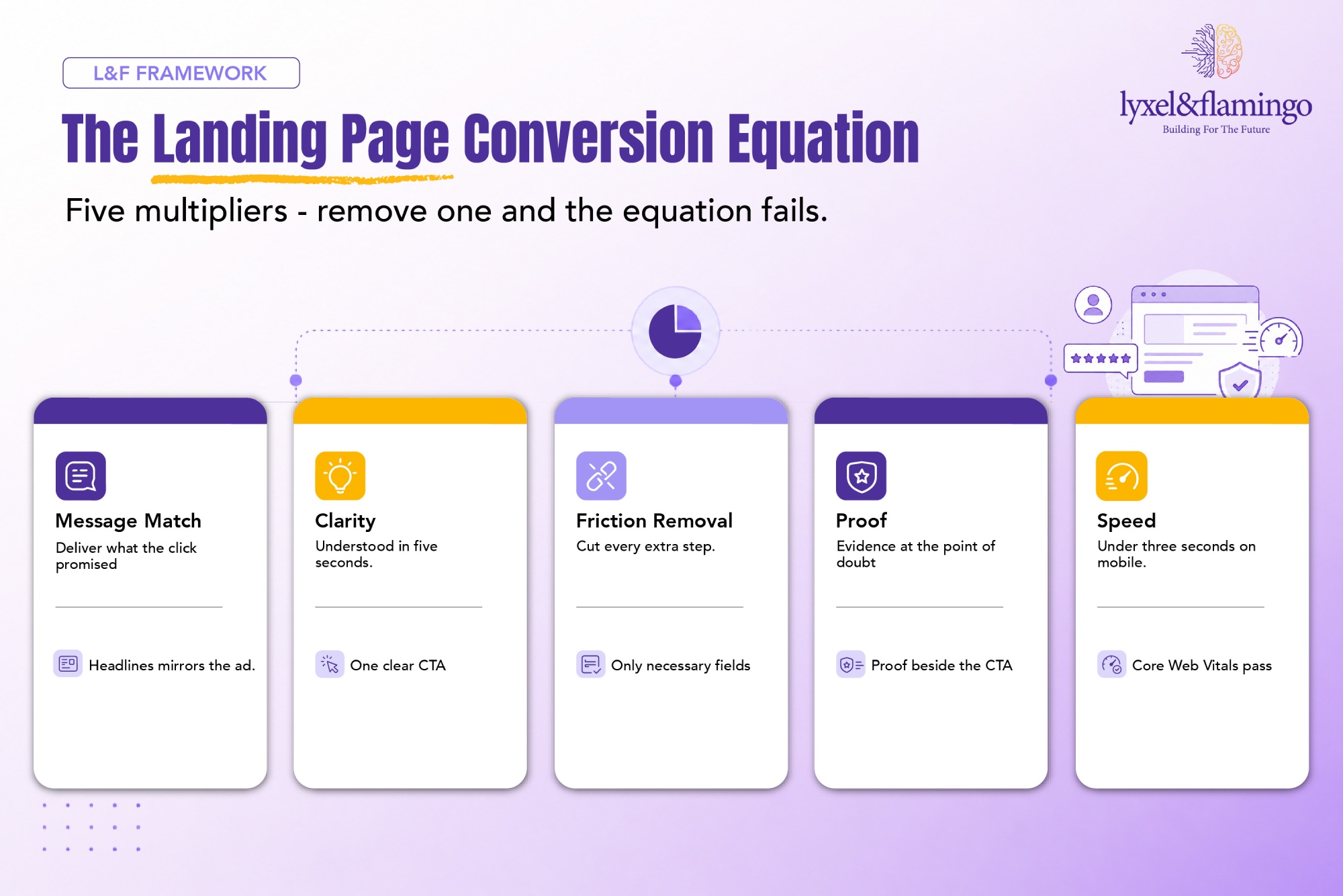
A high-converting landing page is built from five components, in sequence. Remove any one and the equation fails.
Conversion = Message Match x Clarity x Friction Removal x Proof x Speed
The Framework explained
01. Message Match: Is the component that determines whether a user stays or immediately leaves and it operates in the first three seconds of arrival, before any other element of the page has a chance to do its work. Message match is broken by the gap between what the acquisition creative promised and what the landing page delivers. An ad that says “Get your free audit today” landing on a page headlined “Enterprise Solutions for Growing Businesses” has failed the test, even if the audit is buried further down the page. The failure is not deceptive; it is careless. Users do not scroll to find the thing they were promised. They bounce and find a competitor whose landing page keeps the promise the ad made. CXOs should audit every active campaign creative against its destination page headline before any other optimisation work begins.
02. Clarity: Is distinct from message match in that it concerns not whether you delivered on the promise, but whether the user immediately understands the value of what is being offered and what they should do next. Clarity fails when a page is technically accurate but cognitively demanding when users have to read three paragraphs to understand what they are being asked to do, or when there are three call-to-action buttons competing for their attention, each implying a slightly different commitment level. The five-second test is a practical diagnostic: show the page to someone unfamiliar with the brand and ask them, after five seconds, what the page is offering and what they should do next. If they cannot answer both questions correctly, clarity has failed and conversion is suffering.
03. Friction Removal: Is the component that most directly corresponds to the Baymard Institute’s finding that 47% of abandonment is caused by unexpected friction at the conversion step. Friction is not always visible it accumulates across micro-decisions that each seem reasonable in isolation. Asking for a phone number on a content download form. Requiring account creation before purchase. Displaying shipping costs only at the final checkout step. Each of these is a friction point that was almost certainly added by a team with a legitimate internal reason a sales team that wants phone numbers, a platform that requires accounts, a pricing system that calculates shipping late. The CXO’s job is to establish that the user’s friction cost always outweighs the internal operational benefit, and to build processes that verify this before friction is introduced. The same discipline underpins a genuinely high-performing storefront, where every removed step compounds into revenue.
04. Proof: Must be positioned where doubt is highest, not where design convention places it. The standard landing page architecture positions testimonials and credentials at the page footer which is precisely where the least-engaged users read, not where the most-engaged users are making their conversion decision. Effective proof placement means credibility signals appear adjacent to the CTA, immediately below the headline, and at any point in the page where the user might pause and ask “but can I trust this?” Client logos, quantified case study outcomes, named testimonials with job titles, security certifications, and money-back guarantees all function as proof but only if they are present at the moment of doubt rather than appended as a design afterthought below the fold.
05. Speed: Is the most undervalued component in the equation because it is the least visible to the people who control campaign budgets. A creative director can see a weak headline; a marketing manager can feel a confusing user journey. But a 4.8 second load time is invisible to the person reviewing the page on a fast office Wi-Fi connection. The Deloitte/Google finding that a 0.1-second improvement in mobile load speed raises conversion by 8.4% should be expressed in revenue terms in every commercial conversation about page performance. This is exactly why speed belongs on the CXO’s web-ROI ledger rather than buried in developer tooling. If a landing page generates GBP 500,000 in annual pipeline and loads in 4 seconds instead of 2, the commercial team is carrying a recoverable revenue loss that a technical fix could address within weeks.
Real-world scenario: Infosys Cloud Radar
Infosys required a landing page experience for a B2B campaign promoting their cloud capability a context in which the audience (enterprise IT and business decision-makers) is sceptical by default, has a high cost of attention, and will not engage with anything that feels generic or slow.
L&F built the Cloud Radar: a .NET-powered, gamified interactive landing experience built around a “Cloud Score” a self-assessment tool that gave users a personalised readiness score in exchange for engaging with Infosys’s positioning. The whitepaper lead capture was gated behind the score output, creating a value exchange rather than a friction wall.
Applying the Conversion Equation:
- Message Match: The campaign creative promised insight and self-assessment – the page delivered exactly that, in interactive form.
- Clarity: The Cloud Score mechanic made the value proposition immediately tangible “find out where your business stands” is a clearer offer than “download our whitepaper.”
- Friction Removal: The lead capture form appeared after the user had already invested in the experience and received their score, dramatically reducing resistance at the point of data submission.
- Proof: Infosys’s brand authority and the rigour of the scoring methodology served as proof elements visible throughout the experience, not appended at the end.
- Speed: The .NET architecture was built for performance under enterprise traffic conditions.
The result was a B2B landing experience that transformed a passive content download into an active, personalised conversation the kind of engagement that qualifies leads rather than merely capturing email addresses.
Going deeper: the landing page audit checklist
Before any page goes live and at regular intervals afte run this audit:
Message Match
- The page headline uses the same language as the ad or email that drove the click
- The primary offer on the page matches the offer communicated in the acquisition creative
- There is no mismatch between what the user expected and what they see within 3 seconds of arriving
Clarity
- The value proposition is readable and understood within 5 seconds without scrolling
- There is one primary CTA not three variations competing for the same action
- The next step (what happens after the user clicks or submits) is explicitly stated
Friction Removal
- The lead capture or checkout form contains only fields required to progress the user not fields collected for future convenience
- The number of steps to complete the conversion is at its minimum viable count
- All additional costs, terms, or commitments are visible before the final conversion step
Proof
- At least one credibility signal (client logo, accreditation, review, case study) is visible above the fold or immediately adjacent to the CTA
- Proof elements are positioned at the moment of maximum doubt near the form, near the CTA not solely at the page footer
- Any claims made on the page are substantiated within view
Speed
- The page loads in under 3 seconds on a mid-range Android device on a 4G connection
- Core Web Vitals pass (LCP, CLS, INP) across mobile and desktop
- Image assets are compressed and served in next-generation formats (WebP, AVIF)
Key takeaways
- A landing page is a structured conversion argument. Every element either advances it or dilutes it.
- The five-part Conversion Equation Message Match, Clarity, Friction Removal, Proof, Speed – is a diagnostic framework, not a creative checklist.
- Speed is the most under-respected conversion variable: the 0.1-second finding (Deloitte/Google, 2020) means that page weight decisions made by developers directly affect revenue outcomes owned by commercial teams.
- The Infosys Cloud Radar demonstrates that B2B landing pages can achieve high engagement when the value exchange is made explicit a personalised output in exchange for a form submission is more effective than a gated PDF.
- The 47% of users who abandon due to friction at the point of conversion (Baymard Institute, 2024) are being lost to solvable UX problems, not to competitive alternatives.
The CXO takeaway
Every pound spent on paid search, social media advertising, or email marketing ultimately arrives at a landing page and it is at that landing page that the investment is either recouped or wasted. The Conversion Equation is not a creative framework; it is a revenue assurance model. When message match fails, the media budget is paying for bounces. When friction accumulates, the media budget is paying for abandoned forms. When speed is treated as a developer problem rather than a commercial one, the media budget is paying for users who leave before the page renders. CXOs who apply this framework systematically auditing every active page against all five components, at launch and at regular intervals thereafter find that the return on existing traffic improves materially without any increase in acquisition spend. That is the compounding commercial logic of getting landing page architecture right: it makes everything else in the marketing system work harder.
Frequently Asked Questions
As long as it needs to be to resolve every objection a user might have before converting and not one element longer. For simple, low-commitment offers, that is often one screen. For complex B2B propositions, it may require several sections. Length is determined by the conversion goal and the complexity of the trust-building required, not by convention.
Prioritise testing the highest-leverage elements first: headline, CTA text, form length, and hero image. Testing button colour before testing message match is a common misallocation of testing resource.
Industry benchmarks vary widely by sector and offer type. Rather than benchmark against industry averages, benchmark against your own historical performance and optimise incrementally. A 10% lift on your current rate is more valuable than reaching a sector median.
A landing page has a single conversion goal and removes navigation, competing CTAs, and off-topic content. A website serves multiple goals and multiple audiences. Sending paid traffic to a homepage rather than a dedicated landing page is one of the most common and costly mistakes in digital marketing.
Yes, perhaps more so, because B2B decision-makers are busy and have less tolerance for friction than consumer audiences. The 53% abandonment rate at 3 seconds (Think with Google) applies regardless of audience type.