
What this blog covers
Why persona-led design outperforms designing for a generic average user, how to build personas that change interface decisions rather than sit in a slide deck, and what it looks like in practice told through an airline website where three radically different travellers had to be served by the same digital front door.
Table of Contents
- Personas, defined: designing for specific people, not an average
- Why "the user" is the most expensive fiction in design
- Where persona work goes wrong
- Framework: The Persona-Led Design Model
- The Framework explained
- Real-world scenario: an airline and three travellers
- Going deeper: turning personas into interface decisions
- Key takeaways
- The CXO takeaway
Personas, defined: designing for specific people, not an average
A persona is a research-based, semi-fictional profile of a specific type of user – their context, their goal, their emotional state, and the job they are trying to get done. Personas are not demographics (“women, 25-45”); they are intent and situation (“a first-time mother booking a long-haul flight, anxious about managing an infant in transit”). The purpose of a persona is not documentation. It is to make design decisions concrete: when a team knows exactly who they are designing a screen for, the arguments about layout, copy and priority resolve themselves, because they can be answered with “which choice serves this person’s job better?”
Why “the user” is the most expensive fiction in design
When a team designs for “the user,” they design for a statistical average that no real person matches and the result serves everyone slightly and no one well. Persona-led design does the opposite: it optimises for real, differentiated needs, and in doing so it lifts the numbers that matter. The commercial case runs through personalisation and relevance. McKinsey’s research found that companies which get personalisation right generate 40% more revenue from those activities than average players (Next in Personalization, 2021) and personalisation is impossible without knowing who you are personalising for. Personas are the upstream discipline that makes relevance, and therefore that revenue, achievable. They are also how design adapts to distinct buyer cohorts across industries rather than defaulting to a one-size template.
Where persona work goes wrong
- Personas as decoration: Beautiful persona posters that name a fictional “Marketing Mary” but never change a single interface decision. If a persona does not resolve a design argument, it is not doing its job.
- Demographics masquerading as personas: Age and income brackets describe a market segment, not a user’s intent. Two people in the same demographic can arrive with completely opposite jobs to be done.
- One persona quietly winning: On shared surfaces like the homepage, the loudest internal stakeholder’s favourite persona often dominates, and the others are designed out. Real persona work reconciles competing needs rather than picking a favourite.
- No emotional state: A persona that captures what a user wants but not how they feel – anxious, rushed, cautious, excited – misses the single biggest driver of interface needs. A frightened user and a confident one need different designs for the same task.
- Built once, never validated: Personas assembled from assumptions rather than research and never tested against real users encode the team’s biases as if they were facts.
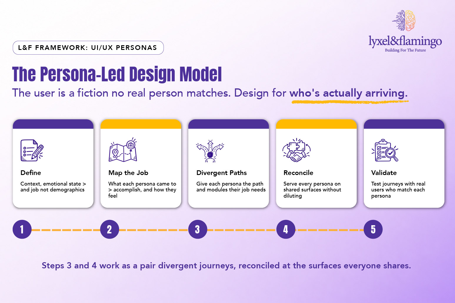
Framework: The Persona-Led Design Model
| Step | What it means | The question it answers |
| 1. Define | Build research-based personas with context, emotional state and job-to-be-done, not demographics | “Who, specifically, is arriving?” |
| 2. Map the job | Identify what each persona is actually trying to accomplish, and how they feel while doing it | “What did they come here to do?” |
| 3. Design divergent journeys | Give each persona the path, modules and content their job requires | “What does this person need that another does not?” |
| 4. Reconcile shared surfaces | Make the homepage, navigation and global elements serve every persona without diluting any | “How do we serve all of them at the front door?” |
| 5. Validate | Test the journeys with real users matching each persona, and refine | “Does this work for the real person, not our idea of them?” |
The model’s discipline is in steps 3 and 4 held together: design boldly divergent journeys for different personas, then reconcile them on the surfaces everyone shares. Skip step 3 and you get a bland average; skip step 4 and the homepage becomes a battleground.
The Framework explained
Define: Is where most of the value is created or lost, because a persona built from demographics will never change an interface decision. A useful persona captures three things: the context a person arrives in, the emotional state they are in, and the specific job they are trying to get done. “A cautious retiree booking travel for the first time in years, worried about mobility and wary of hidden steps” is a persona that immediately implies interface choices. “Over-60s” is a census category that implies nothing.
Map the job: Borrows the jobs-to-be-done lens: people do not want products, they want progress on a problem. For each persona, the team articulates the job in the user’s own terms and, critically, the emotional stakes attached to it. The same airline booking is a routine transaction for a business traveller and a source of genuine anxiety for a parent flying with an infant and that difference in emotional stakes, not the transaction itself, is what should drive the design.
Design divergent journeys: Is the step teams most often skip in the name of consistency, and it is the step that creates competitive advantage. Different personas need genuinely different paths, modules and content, even on the same site. This is not visual inconsistency; the design language stays unified. It is journey divergence surfacing the insurance module for the risk-aware traveller, the assistance request for the passenger who needs mobility support, the baggage-and-boarding clarity for the parent. This is the same principle behind why a healthcare website cannot be designed like a D2C website: different users, in different states, need different journeys.
Reconcile shared surfaces: Is the counterweight that keeps divergence from fragmenting the experience. The homepage and primary navigation have to serve every persona at once, which means they cannot be optimised for any single one. The reconciliation is done through clear routing giving each persona an obvious, early path toward their journey rather than through compromise that serves everyone weakly. This is exactly why the homepage’s real job is positioning and routing, not carrying every task itself.
Validate: Closes the loop by testing the journeys against real people who match each persona, because a persona is a hypothesis until a real user confirms it. Validation catches the assumptions the team encoded without noticing, the step that felt obvious to a designer but stalls the exact person it was built for.
Real-world scenario: an airline and three travellers
On an airline website project, the design challenge was not a single “airline customer.” It was that the same digital front door had to serve travellers whose needs barely overlapped. Three personas made the point vividly:
- The travel-insurance seeker: Risk-aware and planning ahead, this traveller’s job was “protect my trip and my family against what could go wrong.” Their journey needed the travel-insurance option to surface early and clearly, with cover comparison and trust signals not buried three clicks deep as an afterthought at checkout.
- The mother travelling with an infant: Arriving anxious and logistics-heavy, her job was “make travelling with my baby manageable.” Her journey needed bassinet and seat-selection clarity, transparent baggage allowances for infant equipment, boarding-assistance information, and as much as any feature, reassurance, delivered through content that anticipated her worries before she had to search for them.
- The eldercare traveller: Cautious and often booking with accessibility needs, this traveller’s job was “get me there with help and without complication.” Their journey needed wheelchair and special-assistance requests that were easy to find and complete, simplified flows, larger tap targets, and a visible route to human support. This is not a niche concern: the WHO estimates that 1.3 billion people – about 16% of the global population – live with a significant disability, and accessible design serves far more travellers than the label suggests.
The same homepage had to route all three toward journeys that looked almost nothing alike, without collapsing into a lowest-common-denominator design that served none of them. That is the essence of persona-led UI/UX: divergent journeys, reconciled at the shared surfaces, each one designed for a real person with a real job and a real emotional state.
The discipline is not unique to aviation. When L&F rebuilt the Medanta hospital website, the architecture of more than 5,000 pages was shaped around the specific way patients – anxious, time-poor, searching by symptom – actually navigate a health decision. And on the Biotique skincare rebuild, navigation was rebuilt around how a customer with a particular concern actually browses, rather than around how the catalogue was internally organised. Different sectors, same principle: design for who is really arriving.
Going deeper: turning personas into interface decisions
For each persona, force the abstraction into concrete design implications:
- Context: Where and how does this persona arrive (device, channel, urgency)?
- Emotional state: How do they feel – anxious, rushed, confident, cautious – and what does that imply for tone and clarity?
- Primary job: In their own words, what did they come to accomplish?
- Journey entry point: What is the earliest, clearest route to their job from the homepage?
- Signature modules: Which one or two interface elements matter most to this persona specifically?
- Accessibility needs: What does this persona require to use the site at all – tap targets, contrast, human support, simplified flows?
- Proof of success: What single metric shows this persona’s journey is working?
If a persona cannot be turned into at least one specific, testable interface decision, it is not yet a working persona.
Key takeaways
- “The user” is a fiction; designing for a statistical average serves everyone weakly and no one well.
- A working persona captures context, emotional state and job-to-be-done – not demographics, and must change at least one interface decision.
- The Persona-Led Design Model holds two disciplines together: design divergent journeys for different personas and then reconcile them on shared surfaces like the homepage.
- Personas are the upstream condition for relevance and personalisation, the lever behind McKinsey’s finding that personalisation leaders earn 40% more revenue from those activities.
- The airline case shows three travellers – insurance seeker, mother with infant, eldercare passenger – needing journeys that barely overlap, all routed from the same front door.
The CXO takeaway
For a CXO, persona-led design is the difference between a website that reflects the org chart and one that reflects the customer. The test is simple: ask your team who a given page is designed for, and if the answer is “our customers” rather than a specific person with a specific job, the page is almost certainly underperforming for all of them. Personas are not a research nicety to be admired and shelved; they are a decision-making tool that makes design arguments resolvable and makes relevance and the revenue that follows it achievable. The brands that win are not the ones with the most beautiful average experience. They are the ones where each of their real customers feels, quietly, that the site was built for them.
Frequently Asked Questions
Enough to capture genuinely distinct jobs-to-be-done, rarely more than four or five. Too many and the model loses its decisiveness; too few and you are back to designing for an average
More relevant, not less. AI personalises delivery, but it needs a strategy for who it is personalising for and what each type of user is trying to do. Personas provide that strategy; personalisation executes it at scale.
A market segment describes who buys (demographics, value, geography); a persona describes who is using the interface and what they are trying to accomplish. You market to segments; you design for personas.
A combination of user interviews, analytics behaviour patterns, support and sales insight, and, where possible, usability testing. The goal is grounding in evidence rather than assumption, a persona built from opinion encodes bias as fact.