
What this blog covers
If your agency is briefing your hospital or health brand’s website with the same playbook it uses for a skincare label, you have a problem. This blog is written for healthcare decision-makers CMOs, brand, growth and technology leaders and sets out why direct-to-consumer (D2C) web tactics quietly damage patient trust, and the five-priority framework that makes a healthcare website credible, findable and bookable.
Table of Contents
What makes healthcare website design different?
Healthcare website design is the discipline of building a digital experience for people whose dominant emotional state is anxiety, vulnerability or urgency, not aspiration or convenience. A patient is not browsing; they are seeking reassurance, clinical credibility and the fastest safe route to care.
That single difference reshapes everything a D2C site optimises for : where a retail site is built to excite and to sell, a healthcare site is built to reassure and to guide. Persuasion tactics that lift a checkout can actively destroy the trust a patient needs before they will share their symptoms, let alone their data.
Why this matters now
Your website is no longer a brochure that sits behind your brand-it is the shortlist. Google’s hospital-selection research found that around 77% of patients use a search engine before booking, and 61% visit two or more hospital websites before choosing where to go. In other words, prospective patients are actively comparing you and your website is where that comparison is won or lost.
For the healthcare leaders funding that website, the commercial case is not soft. McKinsey’s five-year study of 300 companies found that top quartile design investors grew revenue 32 percentage points faster than their peers (McKinsey, 2018). Design is a growth-lever but only if it is the right design for the audience. And here is the trap: because most agencies cut their teeth on retail and D2C, they default to the tactics that work there. In healthcare, those same tactics suppress conversion and, worse, erode the credibility your clinical brand has spent decades building.
The real pain points
- Patients cannot find their condition. Prospective patients search a symptom or a procedure, not your brand name. A brand-first site with shallow navigation and weak on-site search is invisible at the exact moment intent is highest.
- The booking journey is an afterthought. Every credibility signal on the site exists to get the patient to one action-book, enquire or call. A confusing, multi-step, non-mobile booking flow wastes the entire investment that preceded it.
- Trust signals are buried. Accreditations, specialist credentials, outcomes and rankings are the clinical equivalent of reviews,but they are frequently relegated to a footer rather than placed where doubt peaks.
- Data risk is under-priced. Patient health information is among the most valuable data to malicious actors, and a breach is a brand and regulatory event, not just an IT one. The global average breach now costs USD 4.88m (IBM, 2024).
Framework: The Patient-First Healthcare Web Framework
Rather than borrow a retail framework, brief your website against the five priorities that actually decide whether a healthcare site earns a patient’s trust and their booking-in this order.
1. Clinical Trust
2. Condition-First Findability
3. Anxiety-Aware UX
4. Frictionless Access to Care
5. Compliance and Security by Design
The framework explained
1. Clinical Trust: Before a patient reads a word of your proposition, they are asking one question: “Can I trust this institution with something that matters?” Answer it immediately with accreditations, hospital rankings, verified specialist profiles (credentials, experience and publications) and real patient outcomes placed above the fold, not in the footer.
Where a D2C brand leads with aspiration, a healthcare brand must lead with credibility. This is the foundation; every other priority sits on top of it.
2. Condition-First Findability: Patients arrive searching their symptom, condition or procedure, not your brand. Your architecture must let them navigate by condition, speciality and location, supported by genuinely intelligent on-site search. A retail instinct optimises the homepage; in healthcare, the highest intent entry point is a condition page that ranks, reassures and routes the patient onward to the right specialist.
3. Anxiety-Aware UX: The patient is often frightened and time-poor. The experience must be calm, clear and jargon-free reassuring, never pressuring. That means plain language explanations of conditions and procedures, together with the deliberate absence of dark patterns such as urgency timers, forced upsells and guilt nudges that are common in D2C but toxic in healthcare. Clarity is the conversion strategy.
4. Frictionless Access to Care: Every credibility signal exists to earn one action: booking or enquiry. That flow must be completable in around three minutes on a mobile device, with obvious routes to appointment booking, teleconsultation and callback requests.Given how many patients research and book on their phones, a booking journey that is anything less than effortless quietly forfeits the patients your brand worked hardest to attract.
5. Compliance and Security by Design: A healthcare website handles the most sensitive data there is, so security and compliance are design principles-not a final checklist item. Dedicated, secure infrastructure, data-protection compliance (such as HIPAA or local equivalents) and privacy-first booking keep patient data inside your controlled environment. This priority protects both the patient and the brand and it is precisely where cheap, templated builds expose healthcare organisations to disproportionate risk.
Real-world scenario: Medanta and Agilus Diagnostics
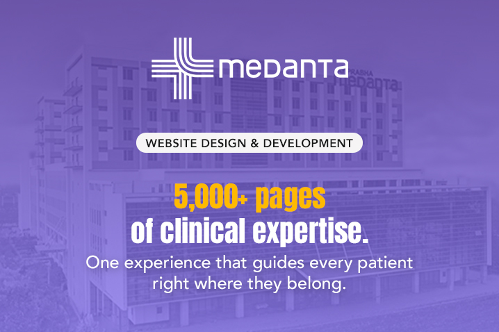
When Lyxel&Flamingo built the website for Medanta, one of India’s leading hospital networks and a Newsweek World’s Best Hospitals listee, the brief was explicitly not “modern and premium” it was trustworthy, navigable and decisive.
Persona and empathy mapping placed patient anxiety at the centre of every information architecture decision. Intelligent on-site search was built to make more than 5,000 pages genuinely findable, because a patient who cannot locate their condition within seconds simply leaves for a competitor’s site.
Clinical specialist profiles, accreditations and procedure-specific content were treated as trust infrastructure, not marketing copy. Every one of the five priorities is visible in that build.
Agilus Diagnostics demonstrates the access-and-security priorities in practice. The platform was moved onto dedicated, secure infrastructure and rebuilt around a frictionless, mobile-first booking journey-book a test, pay online and receive reports-supported by a phlebotomist app for at-home collection.
The result of removing friction from the patient’s real job-“Help me book the right test, near me, right now” was a 22% increase in monthly users within a year, driven by patient-first design rather than D2C persuasion tactics.
The contrast with D2C is the whole point. A retail brand can lead with scarcity and impulse; a healthcare brand that borrows those instincts trades away the clinical credibility that is its single greatest asset.
Going deeper: The Healthcare Website Commissioning Checklist
Use this checklist before approving a website build or briefing an agency.
Clinical Trust
- Accreditations, rankings and outcomes are visible above the fold on both desktop and mobile.
- Specialist profiles include credentials, experience and patient-appropriate information.
Findability
- Conditions, treatments, specialities and locations are each independently navigable.
- On-site search returns condition and specialist-specific results.
- Condition and procedure pages are optimised for the search terms patients actually use.
Anxiety-Aware UX
- Content is written for patients using clear, plain-language explanations.
- No countdown timers, forced upsells or urgency pop-ups appear anywhere in the patient journey.
Access to Care
- Online booking, teleconsultation and callback options are available without requiring a phone call.
- The booking journey can be completed in under three minutes on a mobile device.
Compliance and Security
- Patient data is handled on secure, dedicated infrastructure with documented security protocols.
- The website complies with applicable data-protection regulations, and no third-party tool sends patient data outside your controlled environment.
If more than a few of these checkpoints fail, your website is being designed like a D2C store, and your patients will notice the difference.
Key Takeaways
- A healthcare website’s primary job is to reassure and guide-not to excite and sell like a D2C website.
- Patients compare providers online before booking: around 77% search first and 61% visit two or more hospital sites (Google). Your website is the shortlist.
- Build every healthcare website around five priorities: Clinical Trust, Condition-First Findability, Anxiety-Aware UX, Frictionless Access to Care, and Compliance & Security by Design.
- D2C techniques such as urgency, scarcity and aggressive upselling reduce the clinical credibility that healthcare organisations depend on.
- Medanta and Agilus Diagnostics demonstrate that patient-first design creates measurable business outcomes-from scalable navigation to a 22% increase in monthly users through frictionless booking.
Closing Thoughts
If you lead marketing, brand, growth or technology for a healthcare organisation, the most expensive mistake you can make is to let your website be designed by instincts borrowed from retail. Your patients are not shopping; they are choosing whom to trust with their health, and they are doing it by comparing websites. A site that leads with credibility, lets people find their condition, speaks to their anxiety, removes every ounce of booking friction and protects their data is not a “nicer” website-it is a growth engine and a trust asset for a category where trust is everything. Brief it that way, and the credibility your clinicians have built over decades finally shows up online.
Frequently Asked Questions
Yes-selectively. Mobile-first design, fast load times, clear visual hierarchy and frictionless booking are universal and welcome. What does not transfer is the persuasion register: scarcity, countdown timers, aggressive upsells and entertainment-led hierarchies are trust-destructive in a clinical context.
The booking or enquiry flow. Every credibility signal exists to earn that one action. If the flow is confusing, multi-step or not mobile-friendly, the entire preceding investment in design and content is wasted.
Condition-first. Prospective patients search a symptom or procedure, not your brand. A site that ranks for condition-specific terms and then routes those visitors through a trust-building, specialist-connecting, booking-enabling journey will consistently outperform a brand-first, navigation shallow site.
Yes. Patient health information is among the most sensitive and valuable data that exists, and a breach carries regulatory and ethical weight beyond the financial average of USD 4.88m per incident. Secure, dedicated infrastructure and privacy-first booking are not optional for any organisation handling patient data at scale.
Against patient-first outcomes: appointment and test-booking rate, time-to-booking, mobile conversion rate, organic visibility for condition terms, and return-visitor rate. Third-party validators such as hospital rankings are also legitimate indicators of the digital credibility a high quality site signals.