What this blog covers
Premium and luxury brands frequently undercut their own positioning online with generic ecommerce UX patterns, urgency banners, aggressive discounting language, cluttered upsells, that work fine for mass-market retail and actively work against a premium brand. This covers where that mismatch happens and what premium digital positioning actually requires.
Quick Answer: The most common positioning leaks are urgency and scarcity messaging (“only 2 left!”) borrowed from mass-market retail, cluttered cross-sell modules that make a considered purchase feel transactional, and generic checkout flows with no moment of craft or care built in. Premium digital positioning requires deliberate restraint: more white space, slower-paced storytelling before the sell, and a checkout experience that still feels considered rather than rushed.
Table of Contents
Where Premium Brands Borrow the Wrong Playbook
Most ecommerce UX best practices are optimized for conversion rate on considered, fast purchases, and they work by creating urgency, reducing friction, and surfacing more product. Applied wholesale to a premium brand, these same patterns undercut the deliberate, unhurried positioning the brand has spent years building offline.
The mismatch isn’t that these patterns are wrong, it’s that they’re calibrated for a different kind of purchase decision than the one a premium brand is actually asking a customer to make.
The Urgency Trap
Scarcity and countdown messaging works because it short-circuits deliberation, which is exactly the wrong outcome for a purchase a premium brand wants to feel considered rather than impulsive. A customer buying a premium product wants to feel like they made a thoughtful choice, and urgency messaging actively works against that feeling even when it technically lifts short-term conversion. Nielsen Norman Group’s research on ecommerce UX makes a similar point about matching interface pacing to the actual decision a shopper is making, rather than defaulting to patterns built for impulse categories.
The same logic applies to aggressive discounting language. A visible strikethrough price and a loud percentage-off badge signal mass-market retail, and repeated exposure to that signal erodes the premium positioning a brand has built through every other channel.
Restraint as a Design Principle
White space, unhurried pacing, and a storytelling sequence before the sell are not decorative choices for a premium brand, they’re functional signals of the brand’s actual positioning. A cluttered page with multiple simultaneous asks (buy now, sign up, see related products, limited stock) reads as a brand trying to extract a conversion, not one confident in its own value.
This restraint has to be deliberate, not merely an absence of effort. A minimal page that lacks storytelling and craft reads as underbuilt, not premium. The difference is intentional editing, not simply doing less.
The Premium Digital Positioning Framework
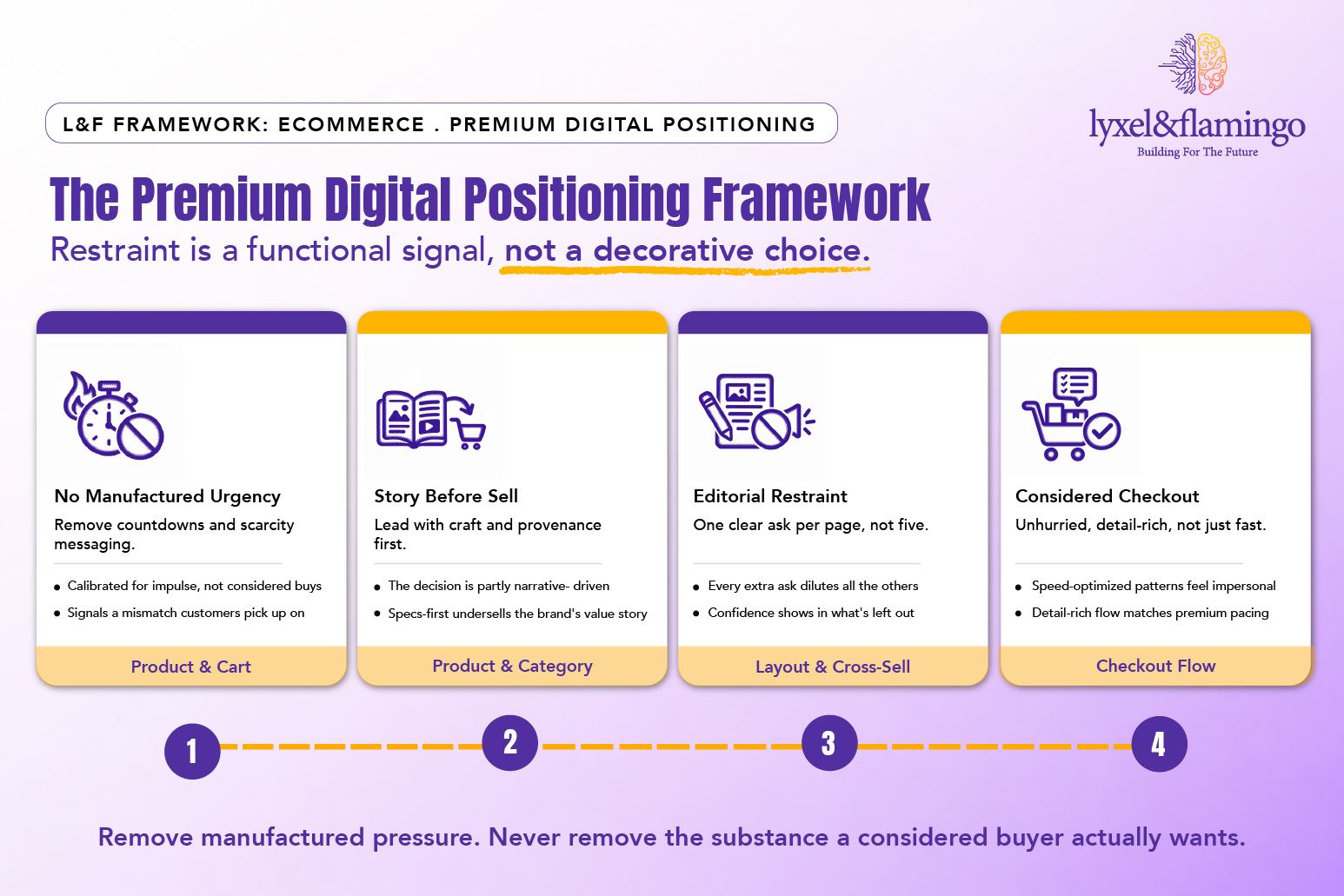
Framework Explained
No Manufactured Urgency: Urgency messaging is calibrated for impulse categories, and applying it to a considered premium purchase signals a mismatch the customer picks up on even if they can’t name it.
Story Before Sell: A premium purchase decision is partly emotional and narrative-driven, and skipping straight to product specs and price undersells the value story the brand has built elsewhere.
Editorial Restraint: Every additional simultaneous ask on a page dilutes the others, and a premium brand’s confidence shows in what it chooses not to ask for on a given page.
Considered Checkout: Speed-optimized checkout patterns, borrowed from high-volume retail, can feel rushed and impersonal for a purchase the customer wants to feel considered and deliberate.
Where Restraint Should Stop
Restraint shouldn’t mean removing genuinely useful information, sizing detail, material specifics, care instructions, all still belong on the page. The goal is removing manufactured pressure, not removing substance. A premium page with real depth and no urgency gimmicks is the target, not a page that’s minimal because it’s underbuilt. Baymard Institute’s UX research backs this distinction with independent usability testing: removing friction and removing information are not the same decision, and conflating them is a common source of the underbuilt feeling a premium page should never have.
What This Looks Like in Practice
Artize’s digital presence work with Lyxel&Flamingo matched a luxury bathware brand’s offline positioning with a digital experience built for the same considered, craft-focused purchase decision, rather than applying generic ecommerce conversion patterns to a category where they actively work against the brand. O3+’s Shopify migration carried the same discipline into a platform move, proof that restraint and craft can survive a full replatforming, not just a redesign. The same protect-the-equity thinking shows up in redesigning a thirty-year-old brand’s site, where an established brand’s positioning was on the line for a different reason: decades of accumulated trust rather than a premium price point.
Key Takeaways
- Generic ecommerce urgency and discounting patterns actively undercut premium brand positioning.
- Restraint, white space, unhurried pacing, story before sell, is a functional signal, not a decorative choice.
- A minimal page without storytelling reads as underbuilt, not premium; restraint has to be deliberate.
- Remove manufactured pressure, not genuine product substance and detail.
CXO Takeaway
A premium brand’s website should be audited against the same positioning standard as its flagship retail experience, not against generic ecommerce conversion benchmarks built for a different kind of purchase decision.
Does your product page ask for one clear decision, or five competing ones at once?
Talk to Lyxel&Flamingo’s technology team about auditing your digital experience against your brand’s actual premium positioning, not generic ecommerce conversion patterns.
Frequently Asked Questions
They’re designed to short-circuit deliberation, which works against a premium purchase decision that customers want to feel considered and thoughtful rather than rushed.
Not minimal for its own sake. It needs deliberate restraint, fewer simultaneous asks, genuine storytelling, without removing substantive product detail that a considered buyer actually wants.
Restraint is intentional editing that still includes real storytelling and product depth. An underbuilt page is simply sparse, without the craft and detail a premium positioning requires.
Not purely for speed. A considered, detail-rich checkout experience matches the unhurried positioning a premium brand builds elsewhere, even if it takes marginally longer than a speed-optimized flow.