
What this blog covers
Why porting a web experience into an app is one of the most common and costly UX mistakes, and the five app-specific patterns that separate an app people keep from one they delete. This is a design blog, not a platform-choice blog – it assumes you have decided to build an app and asks how to make its UI/UX actually convert.
Table of Contents
App UX, defined: a different medium, not a smaller screen
App UX is the design of an experience for the specific conditions of a mobile application: a device held in one hand, operated by a thumb, used on the move and under time pressure, with native capabilities – notifications, gestures, offline storage, hardware – that a website does not have. The defining mistake in app design is treating the app as a responsive website: reusing web navigation, web layouts and web interaction patterns inside a native shell. It looks like an app and behaves like a website, and users feel the mismatch immediately – even if they cannot name it.
Why web patterns fail in an app
The web and the app are used differently, and the difference is physical. On the web, a mouse can reach any pixel; in an app, the thumb comfortably reaches perhaps the lower two-thirds of the screen, so a top-anchored navigation bar borrowed from the web becomes a daily strain. On the web, a slow page is annoying; in an app, users expect near-instant response and abandon fast when they do not get it – the same intolerance that sees 53% of mobile visits abandoned when a page takes over three seconds to load (Think with Google). And the commercial stakes are higher, because app users who do commit are among a brand’s most valuable – engaged app audiences typically transact at materially higher rates than mobile-web visitors – which makes every avoidable friction, and every unnecessary step toward the 70.19% average cart abandonment (Baymard Institute, 2024), more expensive to carry.
Where app experiences lose users
- Web navigation in a native shell. Top tab bars, hover states and desktop menus that ignore how a thumb actually moves across a phone held in one hand.
- An onboarding wall. Forcing account creation, permissions and tutorials before the user has felt any value – the fastest route to a delete.
- Web-grade performance expectations. Tolerating load times and jank that a website might survive but an app will not; app users are less forgiving, not more.
- Notifications as noise. Push used as a broadcast megaphone rather than a relevance engine, training users to disable it or uninstall.
- No resilience. An app that breaks the moment connectivity drops, in a market where connectivity is intermittent, fails exactly when the user needed it.
Framework: The App UX Pattern Model
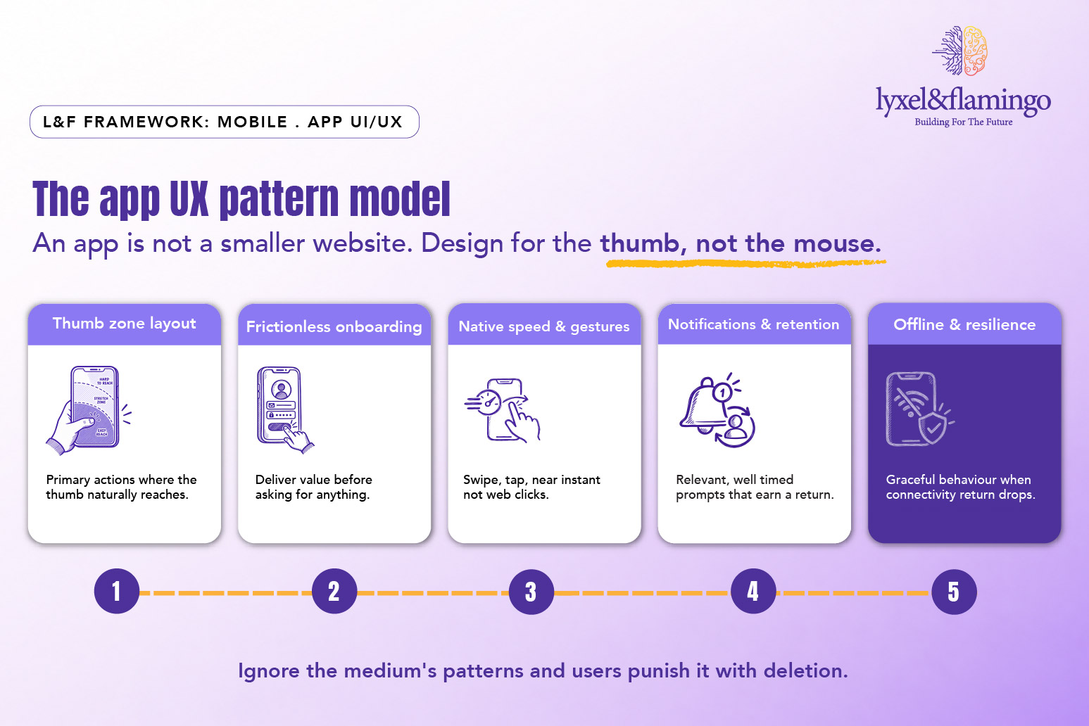
Each pattern reflects something true about the medium that the web lets you ignore. Ignore them in an app and the experience feels wrong in a way users punish with deletion.
The Framework explained
Thumb-zone layout: Is the most physical difference between web and app design. A phone is held in one hand and driven by one thumb, which comfortably reaches the lower and middle portions of the screen but strains for the top corners. Primary actions – the buttons that matter most – belong where the thumb naturally falls, which is close to the opposite of the top-anchored navigation the web trained everyone to build. Designing for the thumb is not a nicety; it is the ergonomic baseline of a usable app.
Frictionless onboarding: Decides whether a downloaded app survives its first session. The temptation is to front-load account creation, permission requests and a tutorial before the user has done anything – and it is the single fastest way to earn a delete. The pattern that works is the reverse: let the user feel the value first, and ask for commitment only once they have a reason to give it. The first session is an audition, and the app that demands before it delivers usually fails it.
Native speed and gestures: Is where an app either feels like an app or feels like a website in disguise. Users expect near-instant response, fluid transitions, and native interactions – swipe to go back, pull to refresh, tap targets sized for fingers – and they abandon jank far faster than they would on the web. This is partly a design decision and partly an engineering one, which is why app UI/UX and the technology build have to be considered together rather than handed off in sequence.
Notifications and retention loops: Are where app value is actually realised, because an install is worthless if it is never opened again. Push notifications are the most powerful re-engagement tool an app has and the easiest to abuse: used as an untargeted broadcast, they train users to disable them or uninstall; used as a relevance engine – well-timed, personal, genuinely useful – they are what turns a one-time download into a habit. The discipline is treating every notification as something that must earn its interruption. This is also where smart, adaptive interfaces increasingly personalise the moment rather than blasting the same message to everyone.
Offline and resilience: Is the pattern the web lets designers forget and the app cannot afford to. Mobile networks are intermittent – a lift, a basement, a patchy signal in transit – and an app that becomes useless the instant connectivity drops fails precisely when a user reached for it. Graceful degradation, sensible caching, and clear feedback about what is and is not available offline are what keep an app trustworthy in the messy conditions of real-world use, which in a market like India is the norm rather than the edge case.
Real-world scenario: Taco Bell and Coffee Island
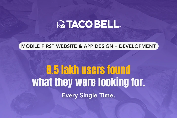
Two L&F app builds show these patterns under real pressure. The Taco Bell app was built to hold up in exactly the conditions that expose weak app UX: peak traffic, promotions that spike demand overnight, and a live loyalty and point-of-sale integration that has to stay in sync while thousands of people order at once. It grew to more than 8.5 lakh users – a scale at which speed, resilience and a smooth ordering flow stop being nice-to-haves and become the difference between a completed order and an abandoned queue. An app that held when demand surged is an app that got the fundamentals – performance and resilience – right.
The Coffee Island engagement, a full-stack mobile app and website for a globally recognised specialty coffee brand, shows the same principle from the brand-experience side: carrying a premium, recognisable brand into a native app means honouring the medium’s patterns – fast, fluid, thumb-friendly, habit-forming – rather than shrinking a website onto a phone. In both cases the lesson is the one this blog is built on: an app earns its place on the home screen by being designed as an app, not as a website that happens to have been installed.
Going deeper: the app UX audit
Before shipping or reviewing an app experience, check:
- Primary actions sit within the natural thumb zone on common device sizes
- The user experiences value before being asked to create an account or grant permissions
- Screen transitions and interactions feel native (gestures, not web clicks) and near-instant
- Load and response times meet native expectations, not web ones
- Notifications are relevant, well-timed and personalised – not broadcast
- A clear re-engagement and retention loop exists beyond the first session
- The app degrades gracefully on poor or absent connectivity
- The experience is designed for the device, not ported from the desktop site
Key takeaways
- An app is a different medium, not a smaller website; porting web patterns into a native shell is the defining app UX mistake.
- Thumb-zone layout is the ergonomic baseline – primary actions belong where the thumb reaches, not in top web-style bars.
- Onboarding should deliver value before asking for commitment; the first session decides whether there is a second.
- Notifications and retention loops are where app value lives – relevance earns re-engagement, broadcast earns uninstalls.
- Taco Bell (8.5 lakh+ users, resilient under peak demand) and Coffee Island show apps designed as apps, not installed websites.
The CXO takeaway
For a CXO, the strategic point is that an app is a commitment the customer makes – space on their home screen, a permission to notify them – and that commitment is only repaid if the experience honours the medium. The most common way app investments underperform is not a failed build; it is a competent web team porting a web experience into an app and wondering why engagement is thin. App users are among the most valuable a brand has, but only if the app earns repeat opens, and earning them depends on getting the medium-specific fundamentals right: the thumb, the first session, native speed, relevant notifications, resilience. Judged by installs, an app is a vanity metric; judged by retention and the transactions it drives, it is one of the highest-value surfaces a brand owns – if it is designed as an app.
Frequently Asked Questions
Brand consistency yes, interaction patterns no. Keep the visual language unified, but design the interactions for the app medium - thumb zones, gestures, native speed - rather than mirroring web navigation.
Decisive. The first session is where most uninstalls are decided. An app that demands account creation and permissions before delivering value loses users who would otherwise have stayed.
When they are relevant and well-timed, they are the most effective retention tool an app has. The risk comes from broadcasting; the value comes from personalising. Treat every notification as something that must earn its interruption.
The patterns - thumb zones, frictionless onboarding, speed, retention, resilience - apply to any app-like experience. The platform choice is a separate decision; these UX principles hold across it.
Because connectivity is genuinely intermittent, and an app that fails when the signal drops fails in everyday use, not just edge cases. Graceful offline behaviour is a core requirement, not a polish item.