
What this blog covers
Most businesses treat conversion rate optimisation as a tactical intervention: change the button colour, shorten the form, A/B test the headline. These tactics can move metrics in isolation. But the businesses that achieve compounding revenue gains from CRO treat it as a system one that begins at the very first brand touchpoint and continues through to post-purchase. This blog explains the full-funnel model and shows what it looks like when a business builds the entire journey as one coherent experience.
Table of Contents
- Full-funnel CRO, defined: conversion as a system, not a screen
- Why the revenue leak is happening across the whole funnel
- Where CRO quietly breaks down in practice
- Framework: The Full-Funnel CRO Model
- The Framework explained
- Real-world scenario: Medanta
- Going deeper: the CRO audit checklist
- Key takeaways
- The CXO takeaway
Full-funnel CRO, defined: conversion as a system, not a screen
Full-funnel conversion rate optimisation is the practice of systematically improving the UX and UI at every stage of the customer journey awareness, consideration, and decision to increase the proportion of visitors who complete a desired action. Unlike point-in-time CRO (fixing the checkout page), full-funnel CRO treats every screen, every interaction, and every friction point as a variable with revenue implications. It is the same logic that turns a website from a cost line into a growth engine: value is created, or lost, at each step, not only at the till.
Why the revenue leak is happening across the whole funnel
The business case for treating UX as a financial instrument is clear. Forrester’s research finds that every GBP 1 invested in UX can return up to GBP 100, a 100:1 ratio that no other marketing or technology investment consistently matches. And yet most businesses under-invest in UX at the top and middle of the funnel, then wonder why conversion rates at the bottom are disappointing.
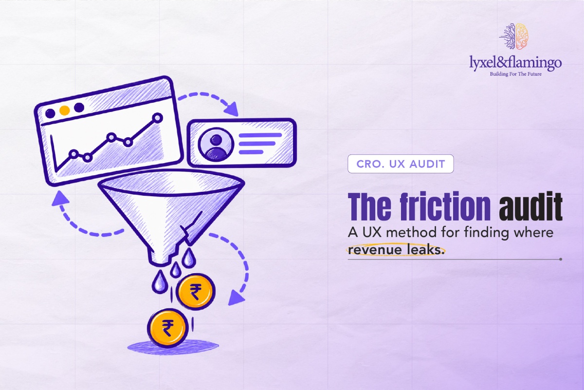
The mechanics are well-evidenced. A 0.1-second improvement in mobile load speed raises retail conversion rates by 8.4% and average order value by 9.2% (Deloitte/Google, Milliseconds Make Millions, 2020). Meanwhile, 70.19% of shopping carts are abandoned on average (Baymard Institute, 2024) and the causes of that abandonment are rarely at the checkout itself. They are the accumulated friction of a journey that was difficult, unclear, or untrustworthy before the user ever reached the basket.
Where CRO quietly breaks down in practice
- Treating CRO as a BOFU-only discipline: Optimising the checkout while ignoring the awareness and consideration stages is like fixing a leaking pipe at one end while the other end remains open.
- Measuring conversion rate in aggregate: A single site-wide conversion rate hides where users are actually dropping off. Without stage-by-stage funnel analysis, the kind that only becomes possible once your analytics are instrumented and read correctly, optimisation efforts are guesswork.
- UX and marketing operating in silos: The brand team controls the awareness stage, the product team owns the transactional journey, and no one owns the handoff between them. That handoff is where conversion is often lost.
- Ignoring mobile experience at TOFU: Over half of users abandon a page that takes more than 3 seconds to load (Think with Google). If your awareness-stage content is slow on mobile, you are losing the funnel before it begins.
- Post-conversion neglect: CRO does not end at purchase. Upsell, review collection, and loyalty onboarding are conversion opportunities that most businesses leave unoptimised.
Framework: The Full-Funnel CRO Model
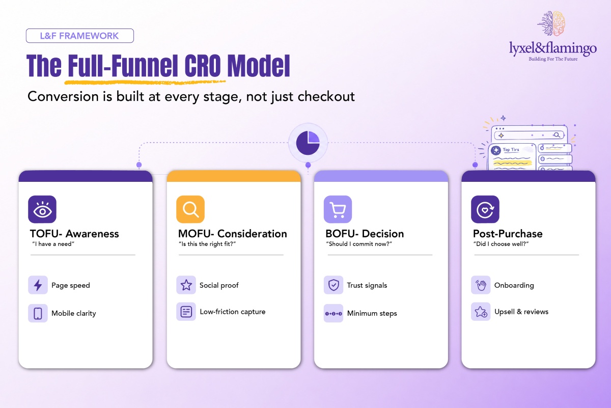
Each stage has a distinct UX responsibility. The output of each stage feeds the next. An optimised BOFU cannot compensate for a broken TOFU.
The Framework explained
01. TOFU – Awareness: Is the stage most frequently treated as a marketing responsibility rather than a CRO responsibility, and that misclassification is costly. The user at this stage has not yet decided whether your brand is worth further investigation. Page speed is the first conversion test they encounter – invisibly, before a single word is read. If the page loads in five seconds, more than half of mobile users have already left (Think with Google). The value proposition must be legible, above the fold, and oriented toward the user’s problem rather than the brand’s features. This is also where the homepage does its real job – not to carry the most traffic, but to establish credibility and route users onward. Bounce rate and scroll depth are the diagnostic metrics: a high bounce rate at TOFU is not a brand problem; it is a speed and clarity problem.
02. MOFU – Consideration: Is where users who survived the awareness stage decide whether to invest further time or trust. Information architecture is the primary lever: can users find the evidence they need – pricing, comparison, credentials, reviews – without having to work for it? This is rarely a one-size-fits-all exercise, because different buyer cohorts navigate and decide differently, and the consideration journey has to be shaped around how your specific audience actually thinks. Lead capture friction at this stage is a particularly common conversion killer. Forms that ask for phone numbers, company revenue, or job titles before a user has received any value in return signal that the business prioritises its own data collection over the user’s experience. Social proof positioned here case studies, accreditations, named client logos does the work of reducing perceived risk at the moment users are most likely to abandon to a competitor.
03. BOFU – Decision: Is the stage CRO practitioners most commonly optimise in isolation, and the results of doing so are predictably modest. The Baymard Institute’s finding that 47% of cart abandonments are caused by unexpected costs at checkout is instructive: users who reach BOFU have already decided they want to buy. What stops them is friction they did not anticipate: fees that appear at the last step, a required account creation, a payment method that is not available. For D2C storefronts in particular, this is where a technically sound platform earns its return. BOFU CRO is therefore as much about transparency and trust architecture as it is about button placement. Every additional step between “I want this” and “I have paid” is a conversion variable that should be challenged.
04. Post-purchase: Is the stage that separates businesses that grow from those that plateau. A user who has just converted is at the moment of highest engagement and lowest defensiveness; they have made a decision and want to feel good about it. The confirmation screen is a CRO opportunity that most businesses waste with a generic “thank you for your order” message. A well-designed post-purchase flow reinforces the purchase decision, introduces the next logical product, prompts a review at a moment of peak satisfaction, and begins the onboarding into a loyalty programme. Repeat purchase rate, NPS, and lifetime value are the metrics that live here – and they are ultimately the metrics that determine whether the business is growing or merely cycling the same customers.
Real-world scenario: Medanta
Medanta is one of India’s largest multi-speciality tertiary care hospitals and has been ranked India’s best private hospital five years running. When they engaged L&F, the challenge was not to build a brochure site – it was to design and build a complete digital journey that could take a patient from a first, anxious question all the way to a booked, paid appointment, across a content estate of more than 5,000 pages, without the scale ever surfacing as the patient’s problem.
Mapped against the full-funnel model, the build reads as a CRO case study in its own right:
- TOFU – Awareness: More than 5,000 pages of specialisations, procedures, and conditions were organised so that any patient on a smartphone in a waiting room or a desktop at home lands on exactly the right page before they have a reason to look elsewhere. Findability and mobile parity were engineered as conversion levers, not cosmetic ones.
- MOFU – Consideration: In healthcare, trust is the conversion currency. Every clinical page was built to be accurate enough to trust, clear enough to act on, and human enough to reassure a patient in an uncertain moment a consideration-stage answer to the question “can I believe this, and is this the right place for me?”
- BOFU – Decision: The EMC booking portal was woven into the journey so it arrived at exactly the right moment, with real-time slot availability and secure online payment. The stated design goal was a path “from first click to booked appointment without a single friction point,” which is the BOFU principle of minimum steps to completion, applied to healthcare.
This is the full-funnel model working as a system: each stage optimised in service of the next, with the end-to-end journey designed as a single coherent experience rather than a set of disconnected pages. The same phased, journey-first thinking underpins other L&F healthcare and diagnostics builds, including the SRL / Agilus programme, where a mobile-first booking experience and a dedicated Phlebo app were built to close the loop between digital booking and physical service delivery.
Going deeper: the CRO audit checklist
Use this audit before any CRO programme begins:
TOFU
- Does the page load in under 3 seconds on a mid-range mobile device?
- Is the primary value proposition visible above the fold without scrolling?
- Is there a clear, single next step for first-time visitors?
MOFU
- Are lead capture forms limited to fields that are genuinely necessary?
- Is social proof (reviews, case studies, credentials) present at the consideration stage?
- Do users have a way to self-qualify (pricing, comparison, FAQs) without speaking to sales?
BOFU
- Is the checkout or booking flow completable in the minimum number of steps?
- Are all extra costs (fees, delivery, taxes) visible before the final confirmation step? (47% abandon due to unexpected costs at checkout, Baymard Institute, 2024)
- Are trust signals (security badges, returns policy, brand credentials) present at the point of commitment?
Post-purchase
- Is there a structured upsell or cross-sell moment after conversion?
- Is the confirmation experience designed to reinforce the purchase decision?
- Is there a prompt for review or referral within the first 48 hours?
Key takeaways
- CRO is a full-funnel discipline: Optimising the checkout while ignoring TOFU and MOFU is like fixing the wrong end of the problem.
- The Forrester 100:1 return on UX investment is achievable but only when UX is treated as a revenue function, not a design function.
- The Medanta build shows what “funnel as a system” means in practice: 5,000+ pages made findable at TOFU, clinical trust built at MOFU, and a frictionless booking-and-payment flow at BOFU all designed as one journey.
- The 0.1-second speed improvement finding (Deloitte/Google, 2020) applies at every stage of the funnel – especially TOFU, where slow loads eliminate users before they can be qualified.
- Cart abandonment at 70.19% (Baymard Institute, 2024) is a symptom of full-funnel friction, not a checkout-specific problem.
The CXO takeaway
For a CXO, the full-funnel CRO model reframes a question that is often framed too narrowly. The question is not “what is our conversion rate?” The question is “at which stage of the journey are we losing the revenue we have already paid to acquire, and why?” Each drop-off point in the funnel represents money that was spent on awareness through paid media, SEO, content, or brand and then lost to friction, confusion, or broken trust before it could be recouped. The Forrester 100:1 return on UX investment is not a theoretical figure; it is the compounded effect of removing friction at every stage, repeatedly, over time. The businesses that treat CRO as a permanent operating discipline – not a one-time optimisation sprint are the ones whose revenue per visitor grows quarter after quarter, independent of traffic volumes. That is the business case for doing this properly.
Frequently Asked Questions
UX is the discipline; CRO is the outcome it drives. Good UX - clear navigation, fast load times, minimal friction - directly improves conversion rates. They are not separate workstreams.
Start with a funnel audit: instrument your analytics to see exactly where users drop off. Fix the stage with the highest drop-off rate first. That is almost always a better use of budget than redesigning the homepage.
Tactical changes (speed optimisation, form reduction) can show results within weeks. Structural changes (information architecture, funnel redesign) typically take three to six months to stabilise in the data.
Absolutely. The funnel stages apply equally - the conversion event is different (a sales-qualified lead rather than a purchase), but the principles of reducing friction, building trust, and delivering clarity at each stage are identical.
Personalisation is a multiplier on CRO. McKinsey’s research found that personalisation leaders generate 40% more revenue from those activities (McKinsey, Next in Personaliz