
What this blog covers
Most organisations still commission UX as visual finishing, applied after the architecture is set. This blog argues that UX is a thinking methodology applied at the earliest strategic layer and that the highest-performing digital experiences are designed around buyer cohorts, not buyer averages. It introduces the Cohort-Led Design framework and validates it against real client outcomes across healthcare, D2C, and B2B.
Table of Contents
What is cohort-led UX design?
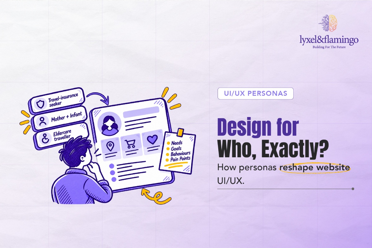
Cohort-led UX design is the practice of structuring the entire digital experience architecture, content hierarchy, interaction patterns, trust signals, and conversion flows around the distinct jobs, emotional states, and decision-making patterns of specific buyer cohorts, rather than around a single average user. It begins with empathy mapping and Jobs-to-be-Done analysis per audience segment, and it treats the resulting design system as a strategic business instrument rather than a visual deliverable.
Why this matters now
UX investment has a compounding return that most organisations are not measuring. Forrester’s research finds that every £1 invested in UX can return up to £100: an ROI of up to 9,900% (Forrester). McKinsey’s five-year analysis of 300 companies found that top-quartile design investment correlated with revenue growth 32 percentage points faster than peers and total shareholder returns 56 percentage points faster (McKinsey, 2018). These are not UX metrics. These are business metrics, driven by design discipline.
The personalisation dimension compounds the argument further. McKinsey’s Next in Personalization research found that personalisation leaders generate 40% more revenue from those activities than average players, with personalisation typically driving a 10-15% revenue lift (McKinsey, 2021). Personalisation, the ability to serve different experiences to different cohorts, is not technically possible unless the UX architecture was designed with cohort differentiation in mind from the outset. You cannot retrofit cohort-sensitivity onto a monolithic design.
The real pain points
- UX is briefed as aesthetics, not strategy: Brand leaders ask agencies for “a modern look and feel” rather than “a design system that converts our three primary buyer cohorts at each stage of their decision journey.”
- Buyer cohorts are averaged out of existence: When a single design must serve a 28-year-old first-time buyer and a 55-year-old corporate procurement manager simultaneously, the result satisfies neither.
- Empathy mapping is treated as a workshop exercise, not a design input: The outputs of persona and empathy work disappear into a PDF that is never opened again after kick-off.
- Industry-specific trust signals are ignored or genericised: What builds confidence for a patient booking a cardiac procedure is structurally different from what builds confidence for an SME comparing accounting software, yet both sites end up with the same hero image and the same five-star widget.
- Design systems are not stress-tested against cohort edge cases: A navigation architecture built around one primary user type will consistently fail secondary users, often the highest-value segment.
Framework: Cohort-Led Design
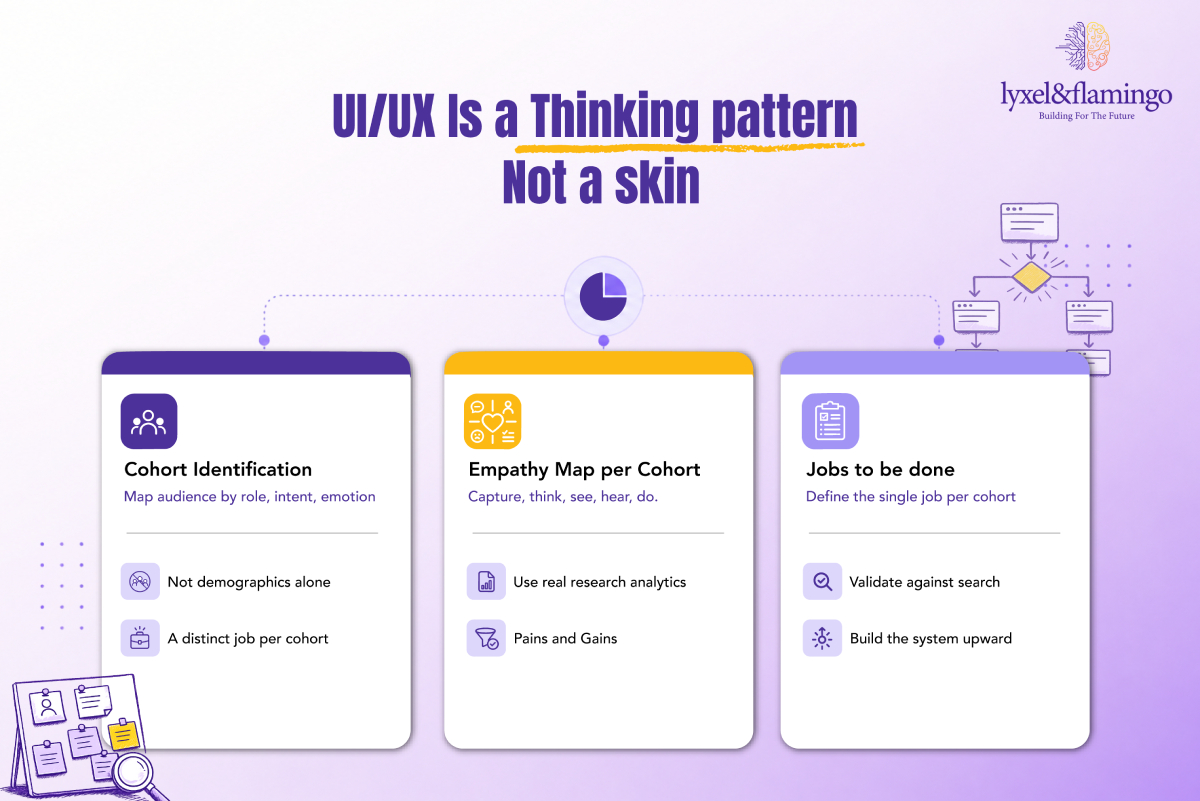
The Cohort-Led Design framework operates in three phases and two tools.
Phase 1: Cohort Identification
Map your audiences by role, intent, and emotional state, not by demographics alone. A patient, a carer, and a referring physician visiting the same hospital website have entirely different jobs to be done. A retail buyer and a trade buyer visiting the same home décor site have different trust thresholds, different content needs, and different conversion triggers.
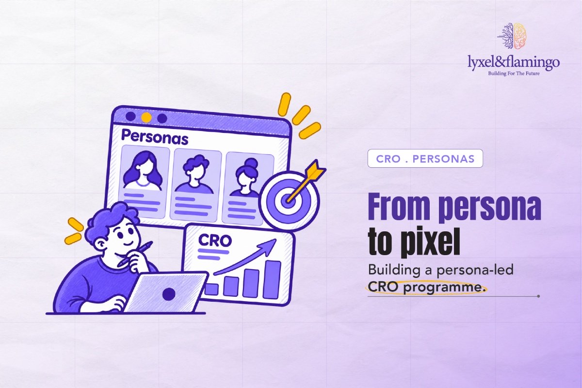
Phase 2: Empathy Map per Cohort
For each cohort, complete the following matrix:
| Dimension | Questions to answer |
|---|---|
| What they think & feel | What is their primary anxiety? What outcome are they hoping for? |
| What they see | What does their information environment look like before they arrive at your site? |
| What they hear | Who influences their decision? What have they been told about you? |
| What they say & do | What actions do they take on the site? What language do they use in search? |
| Pain points | What friction causes abandonment? What unanswered questions create doubt? |
| Gains | What would make this the easiest decision they make this week? |
Phase 3: Jobs-to-be-Done Mapping
For each cohort, identify the single most important job they are hiring your website to do.
| Industry | Cohort | Primary JTBD |
|---|---|---|
| Healthcare | Patient | Help me understand whether this hospital can treat my condition and make it easy to book. |
| Healthcare | Referring physician | Give me clinical evidence and a fast referral pathway. |
| D2C beauty/skincare | First-time buyer | Help me find the right product for my skin type without feeling overwhelmed. |
| D2C pet care | Pet parent | Show me the product is right for my specific breed and make reordering effortless. |
| BFSI | SME business owner | Show me that you understand my risk profile and give me a clear next step. |
| B2B / Manufacturing | Procurement manager | Let me filter by specification and validate lead times without calling a sales rep. |
The design system: navigation depth, CTA language, content hierarchy, trust signal placement, search functionality is then built from these JTBD outputs upward, not from a visual inspiration board downward.
The Framework Explained
Phase 1: Cohort Identification
The most common failure at this stage is defaulting to demographic segmentation: age, gender, geography. These are descriptors, not decision drivers. A 45-year-old male and a 45-year-old female can have identical JTBDs when booking a cardiac consultation. What matters is role, intent, and emotional state at the moment of arrival. A CXO applying this phase should ask their team: “What is each cohort trying to accomplish, and how are they feeling when they start trying?” The answer will almost always reveal that the organisation has been designing for one cohort, typically the most internally visible one, while ignoring the others entirely.
Phase 2: Empathy Map per Cohort
The empathy map is valuable precisely because it forces the design team outside the organisation’s own frame. “What they see” and “What they hear” are the two dimensions most commonly skipped in internal briefing processes, yet they are the ones that explain why visitors arrive with the assumptions, anxieties, and prior knowledge they bring. A patient who has spent two hours reading forum posts about a diagnosis arrives in a completely different information state than a patient whose GP just referred them. Both arrive at the same homepage. The empathy map surfaces that difference and forces the design system to accommodate it. The failure mode is treating the empathy map as a workshop deliverable rather than a living design input, one that should be updated as analytics data accumulates.
Phase 3: Jobs-to-be-Done Mapping
JTBD is not a persona. A persona describes who someone is; a JTBD describes what they are trying to accomplish and why they have decided to try to accomplish it now. The “now” matters: a procurement manager evaluating three competing suppliers is in a fundamentally different decision state than the same manager maintaining an existing supplier relationship. The JTBD table defines the design brief for each cohort far more precisely than any persona document: if a B2B procurement manager’s job is “filter by specification and validate lead times without calling a sales rep,” then the navigation architecture, search functionality, and product catalogue design all flow directly from that statement. Any design decision that forces the procurement manager to call a sales rep has failed the brief. This is how the framework converts strategic insight into design requirements, not by inspiring the team, but by constraining it productively.
Real-World Scenario: Medanta & L&F Portfolio Breadth
Medanta’s UX challenge was a masterclass in cohort-led thinking at scale. With 5,000-plus pages and visitor cohorts ranging from anxious patients researching rare conditions to international medical travellers evaluating hospitals to referring physicians looking for specialist contacts, a generic design would have served none of them well.
Lyxel&Flamingo anchored the entire build in persona and empathy mapping and design-thinking methodology. Google Analytics and Search Console data were used not just for SEO but to understand the real language patients use when they are frightened, uncertain, and searching for reassurance. That language fed directly into content architecture and search functionality. The resulting intelligent on-site search makes the full content estate navigable by all cohorts, without any single cohort needing to navigate through content built for another.
The same cohort discipline shows up across the L&F portfolio in different forms. For Royal Canin, the D2C pet-care storefront was built around the pet parent cohort, fusing a product catalogue with a content hub (puppyhood guides, breed-specific advice) that addresses the JTBD of a buyer who wants to be a better pet owner, not just a purchaser. For O3+ skincare, a skin-analyser tool built into the Magento store addresses the first-time buyer’s core anxiety: “Which product is right for me?” For Delta Faucet India, a B2B/home-goods buyer with highly specific technical requirements gets runtime filtering with no page reload, the UX equivalent of a patient salesperson who never wastes your time.
Same framework. Very different executions. That is what industry-specific UX design looks like in practice.
Going Deeper: The Cohort Design Audit
Run this audit before your next major site investment.
- Have you identified all primary and secondary visitor cohorts by role, intent, and emotional state, not just by demographic?
- Has an empathy map been completed for each cohort, using real user research or analytics data (not internal assumptions)?
- Has a primary JTBD been defined for each cohort, and validated against actual search behaviour?
- Does your navigation architecture offer distinct pathways for each primary cohort without requiring explicit self-identification?
- Are the trust signals on your site differentiated by cohort: clinical evidence for medical professionals, patient testimonials for patients, technical specs for procurement?
- Is your on-site search returning results that serve all cohorts, not just the most common one?
- Has the design system been stress-tested against your lowest-frequency but highest-value cohort?
Score of 5 or below means your current design is likely serving one cohort well and alienating the others.
Key Takeaways
- UX is a thinking discipline applied at the strategic layer, not a visual skin applied at the delivery layer.
- Top-quartile design investment correlates with 32pp faster revenue growth over five years (McKinsey, 2018); cohort-led UX is central to that investment.
- Personalisation leaders generate 40% more revenue than average players (McKinsey, 2021), and personalisation begins with cohort architecture.
- The Cohort-Led Design framework has three phases: cohort identification, empathy mapping, and Jobs-to-be-Done mapping, in that order.
- The same framework produces very different executions: Medanta’s intelligent search, Royal Canin’s content-commerce fusion, and Delta Faucet’s no-reload filtering are all cohort-led outcomes.
Closing Thoughts
The organisations that are winning digitally are not necessarily the ones with the largest design budgets; they are the ones that applied design thinking at the right moment: before the architecture was set, before the navigation was decided, before the content was written. Cohort-led UX design is that thinking made operational. It replaces the brief of “make it look modern” with the brief of “make it work for the specific people who need to use it in the specific emotional states in which they will arrive.” The McKinsey and Forrester numbers confirm what good design practitioners have known for decades: this approach produces compounding commercial returns. The CXOs who recognise that are not just investing in better websites; they are building durable competitive advantages that their competitors cannot easily replicate, because the discipline behind the output is not visible in the output itself.
Frequently Asked Questions
Most sites have two to four primary cohorts worth designing for explicitly. Beyond four, the architecture becomes unwieldy. The discipline is in identifying which cohorts have sufficiently different JTBDs to warrant distinct pathways and being honest about which cohorts the business most needs to convert.
Related but distinct. Cohort-led design creates the architectural conditions in which personalisation becomes possible. A site that has been built for a single average user cannot deliver cohort-differentiated experiences even if the technology to do so is available. Cohort-led design is the prerequisite; personalisation is the activation.
Start with what you have. Google Analytics audience reports, Search Console query data, sales team call notes, and customer support tickets are rich, free, and underused sources of cohort insight. They tell you who is arriving, what they are looking for, and where they are giving up. Empathy mapping from these sources is directionally reliable enough to make strong design decisions.
Emphatically yes - and arguably more so. B2B buyer journeys are longer, involve more cohorts per purchase decision (procurement, technical evaluation, budget approval), and carry higher switching costs. A B2B site that fails to address each cohort’s JTBD at the right stage of the buying process is leaving significant pipeline on the table.
Before wireframes, before architecture, before a single content decision. Cohort and empathy work should precede and inform everything downstream. If it is happening after the navigation is set, it is too late to be fully effective - you are retrofitting insight onto a structure that was built without it.