Every business present online will have a website or app. Now, whichever platform you are operating, the initial job is to capture the attention of the customer visually.
In order to achieve this, the design of the website plays a critical role. A well-designed web portal of your company will capture, engage and finally lead your customer to convert into a sale.
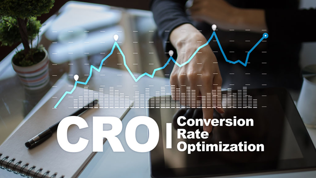
Thus, your final goal as a business is to increase your conversion rate so that you’re growing.
However, web designing requires you to consider many factors, which even include what to avoid.
As we advance, we will discover what conversion is and what factors to consider or avoid while designing a website.
Understanding Conversion Rate
The more conversions you get, means more business growth and better returns for your marketing initiatives. The conversion rate in e-commerce websites has a clear link to your sales revenue and profit margins.
Failing to convert means that somewhere in the customer’s journey through the website, they decided that you are unable to provide what they need.
Therefore, they moved on to your competitor with better user experience-optimized websites.
Yes, that is the truth! The experience you give to your customers is more important than what you sell.
You can consider website sale conversions as a reward visitors give in exchange for being helpful, adding value, and providing answers to what they seek as their end goal.
The best way for conversion rate improvements is to make the conversion journey easy for your potential customers.
Designing Factors to Avoid for a Better Conversion Rate
1) Complex Navigation:
If your website’s navigation is complex, your visitors will quickly leave and most likely never revisit your website.
There is no use in having a lot of content, photos, or links if customers cannot easily find what they are looking for on the website. The simplicity of navigation plays a vital part in converting your website visitors into customers.
Navigation is the only way to direct your customers to the products or services you are providing on your portal to increase your conversion rate. Planning and executing the right navigation tactics encourage visitors to easily find their way and subscribe to or purchase your offerings.
Therefore, keep your visitors on the right track by providing obvious and sufficient call-to-action buttons and links that lead to the correct pages.
2) Inconsistent Content Layout:
You must maintain uniformity in representing the content across all web pages of your site. For example, using one size, font, and color for the headers on one page and another for the other web page will create visual inconsistency for users.
Your website won’t look orderly and pleasing to the eyes, causing an unnecessary distraction and hampering conversion rate improvements.
Even if, at times, you may have to combine different aspects, it must still get done sensibly, keeping in mind the aesthetics. Consistency is the key to capturing your visitor’s attention and maintaining a good brand reputation.
Moreover, ensure that you consistently place all the company logos in the same location on all the web pages.
3) Over-the-Top Colour Scheme:
Colors play a crucial role in the web designing process. They help highlight CTA buttons and various links and even enhance the user experience.
Choosing the wrong color combination can adversely affect the customer’s experience and conversion rate. Moreover, going over the top while using color schemes can confuse visitors and create confusion about your website design. Therefore, you must stick with a couple of colors that effectively reflect your company’s brand image.
Therefore, carefully examine the best color combinations that will persuade customers to spend more time on your website. The right color combinations can help customers feel more relaxed while browsing your online e-commerce store or website.
4) Slow Page Loading Speeds:
A slow page loading speed destroys your website’s conversion rate. It is because no one wants to wait for more than a few seconds for a web page to load. So if your website takes more than 2 seconds to load, your visitors will proceed to the next one.
A person searching the internet wants to receive information instantaneously, and a slow page loading time will definitely make them lose interest.
In addition, longer page loading speeds reduce the ranking of your website on search engines. So gradually, with time, people will be unable to find your website listing on the search engines.
Some of the ways you can get better page loading speeds and conversion rate improvements are:
- Keep a check on the number of plug-ins you use on the site.
- Avoid using heavier images on web pages.
- Optimize videos and images for search engines.
5) Wrong Placement or Missing CTA Buttons:
It is a fact that when your web pages are missing out on clear Call to Action (CTA) buttons, there will seldom be any customer conversions. Therefore, you must convey a clear message about what you want your visitors to act on when visiting your website.
Unless you nudge visitors to act on something on your web pages, they won’t sign up, contact you or purchase your products and services. Your chance to improve your conversion rate by signing potential customers for your solutions is lost if your page does not contain a prominent CTA button.
The CTA button color needs to stand out among all the content visible on the web pages. Moreover, it should effectively communicate what will happen when they press the button with clearly stated text.
Most importantly, the positioning of this button must be strategic so that visitors can notice it clearly. After all, the primary purpose of a CTA button is to encourage visitors to buy something.
6) Including Too Many Ad Banners:
Although ad banners are an excellent source of revenue for the website, too many of them could negatively impact the conversion rate in e-commerce websites.
Using ad banners excessively makes the website appear as one life-size advertisement billboard, which can repel your visitors from the website.
Try to ensure that the ads don’t keep appearing suddenly when a person is checking out your services or the product page. It can easily influence your customers to exit your website on the whole.
It is better to place all banner ads on one side of the page so that they don’t hamper visitors’ shopping or information-gathering process.
A website with pages that are simple can help you accomplish a greater conversion rate for the business.
7) Using General Stock Images:
Visual content drives more visitor engagement apart from adding aesthetic value to your website. However, it won’t work to your advantage if you use general visuals that feature on many websites all over the internet. Stock images are unsuitable because they are generic, and your customers can take offense to this false representation.
Therefore, don’t opt for stock images to represent anything on your web pages. Instead, it would be best if you only utilize images of the finest quality, have meaning, are appropriate to your products or services, and are unique to you.
Make sure every image you use on your website has a purpose and motivates potential customers to purchase, leading to conversion rate improvements.
8) Overloading Content with Information:
The age of reading long paragraphs of detailed information is over. Nobody has the time or patience to read too many words, especially on a website. Thus, today’s trend is to keep everything crispy and short for visitors.
People visit your website to find quick and clear information about your services or products. If you provide too much general information on your website, you will not only drop the interest levels of the visitors, but it is also a futile way of marketing your products and services.
Many e-commerce business websites emphasize only the special benefits to encourage purchasing.
Video is another way companies are adapting quickly without overloading content with information. It can significantly increase the customers’ impression of your brand, which is crucial for sales revenues, meaning a higher conversion rate.
Conclusion
The struggle to win over online customers is immense. A website that can grab customers’ attention and simplify their lives triumphs most of the time. That is why it is essential to design simple websites with concise content. The smallest website design mistakes could eventually minimize your sales conversions. There are so many factors that you must consider and avoid in order to grow your online business. If you feel any of these above points apply to your website, it’s time to think about working on a new design by avoiding these mistakes, and then you will see your conversion rate soar.
